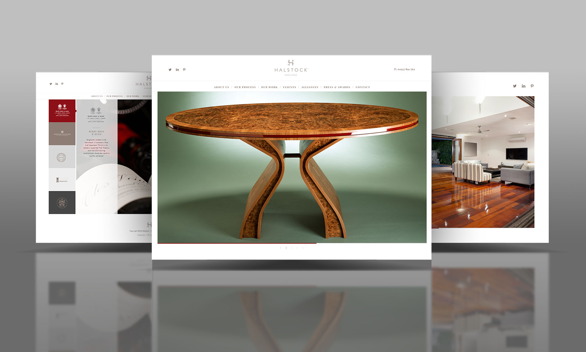
Halstock website re-design is the most recent project to be completed by AJA Design, going live on 26th October.
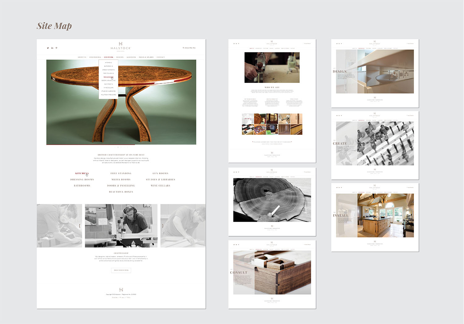
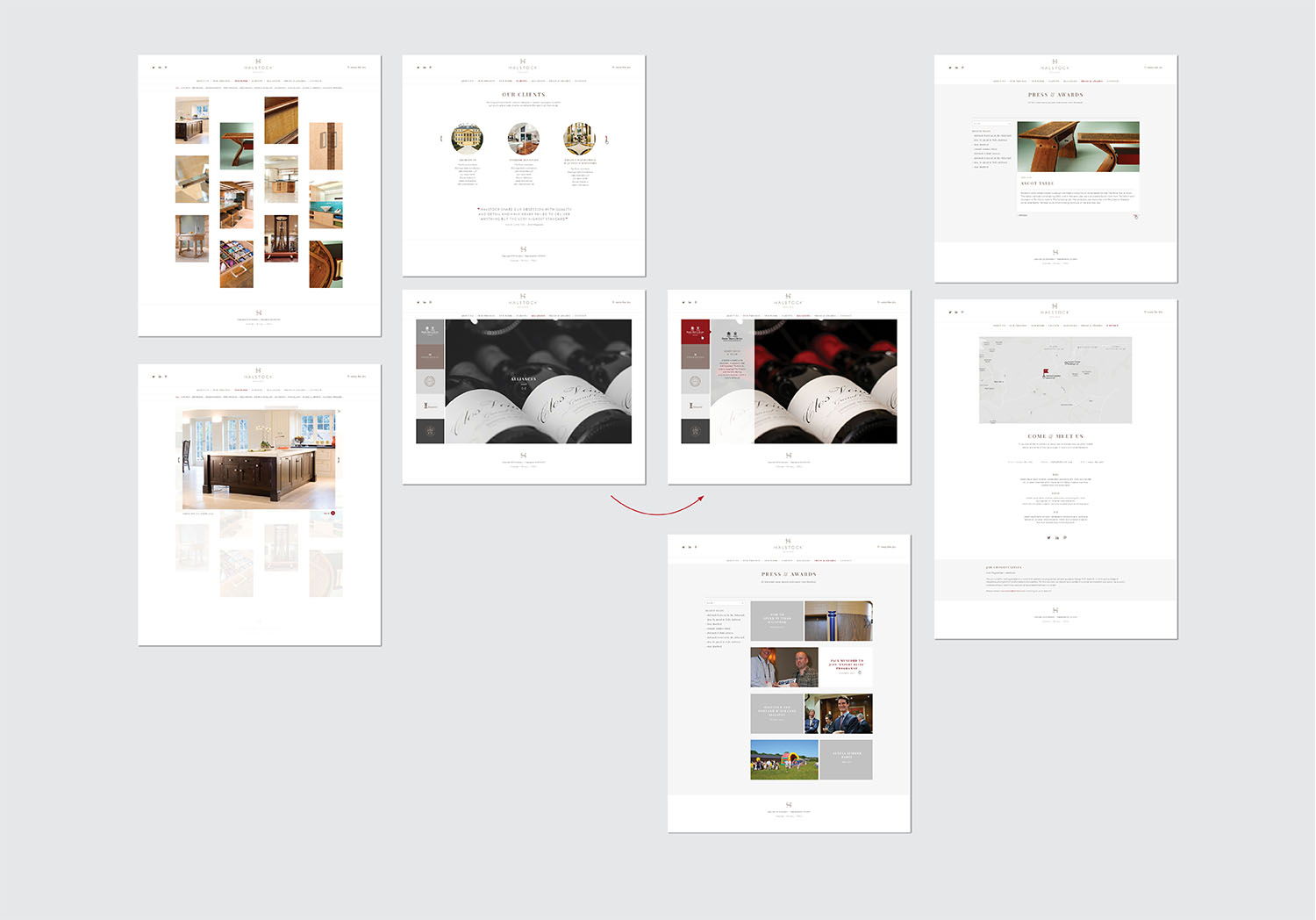
Halstock design, manufacture and install luxury bespoke interiors. Working with architects, interior designers, project managers, quantity surveyors and private clients, they demand the best. So the challenge for us with the Halstock website re-design was to develop a website that reflected “all that is Halstock”. The gallery is a large proportion of the site, with each category of project, from bathrooms and kitchens to gun rooms and wine cellars, further segmented down to individual projects.
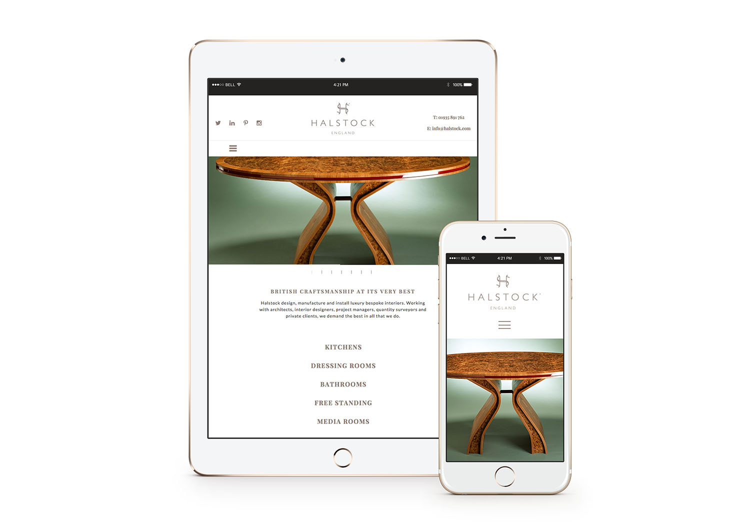
The site is fully responsive and therefore works beautifully on hand-held devices. Go on, try it! There has been a radical shift in browsing habits. Mobile Internet usage has now overtaken desktop browsing, which means that now more than ever it is important that your website is optimised for mobile devices.
A well considered responsive website adapts its layout based on the current screen size of the device. This means your website will fit virtually any device which uses a web browser. As well as adjusting to different desktop screen resolutions, it also works across smartphones, tablets and smart TVs. Try re-sizing your browser window on the main AJA Design home page and you will see how we’ve implemented the technique to optimise your viewing experience.
Five reasons why you should consider responsive design for your website:
Better usability
Display specific content
No need for multiple platform specific apps
Publish content only once
SEO benefits
Take a look at an article we wrote recently on a few ‘websites we love‘, we find it inspiring!

Halstock design, manufacture and install bespoke interiors for the high-end residential market. They work with architects, interior designers, project managers, quantity surveyors and private clients who demand the highest quality and specification.


