“In the physical world, a skeuomorph is an ornamental version of something that was, in an earlier product, a functional necessity.”
In the 1980s, digital designers chose to use skeuomorphs for on-screen icons to help convey their meanings. i.e. folders look like physical filing folders. This helped the public make the transition from print to computers.
Nowadays the majority of people are familiar with digital navigation and therefore we don’t always need these design features to make the transition. Skeuomorphs are slowly being removed from digital design leaving behind much cleaner and simpler user interfaces. We have introduced a much simpler user interface with our new AJA site.
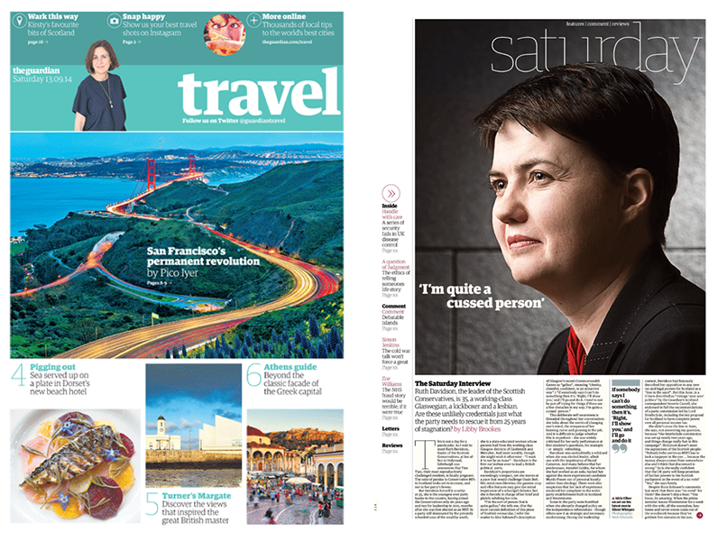
In this Digital Age, people understand simpler iconography and user interfaces, it therefore makes sense for designers to begin introducing digital elements into print. We are beginning to see more icons such as arrows, and location pointers being used throughout print. Social media now plays a large part, rather than stating “visit us on facebook” designers commonly use just the F icon and we often see quotes taken from Twitter.
The Guardian and the Financial Times are two examples of companies who are adapting to the Digital Age through their print material.
“The aim is to translate the information and style seamlessly between print and digital formats” – Financial Times
“Our aim is to harmonise the Guardian’s new design language across all platforms” – The Guardian
“We know many of our readers consume the Guardian across both print and digital, and this new look brings a seamless, consistent and familiar experience wherever and however people choose to read our content.” – Guardian Creative Director Alex Breuer