
I want to talk about fashion eCommerce websites because they’re so much fun to be involved with but at the same time full of caveats. I’ve watched over the creation of numerous clothing brands’ sites now, and there are recurring themes in their development that clients ought not forget.
Product first, always
Do not get carried away with design! Yes, we all love filters and fancy graphics – and these are super for producing an engaging environment – but you should never, ever undermine your product. Much in the same way brands have guidelines for how their products appear in television advertising (the sound of the apple bite, the shot of the packaging), you must give your designer some rules, and stick to them yourself. Basically, don’t detract from what you’re selling.
– Don’t have text or banners crashing your products’ image space
– Don’t filter or put an overlay on the product in the photograph
– Do start with the product and extrapolate out
Content is still king
So, you’ve built your site, your products are up, and everything looks great: where are the orders? I always bang on about the need for a space for new content. Don’t forget to include an engaging blog that’s updated regularly! Two things are needed to sell: a product and people talking about that product. Nobody is going to start talking about it unless you tell them about it. If you’re an established brand, perhaps four or five articles per week will cover you; if you’re new, then you will need to produce far more: ASOS have been known to release ten articles a day!
– Do be consistent: know how much you can write and when you can publish it, and then stick to it
– Do use web-friendly headlines. Being clever can grab some attention, but choosing article titles that answer or raise questions will keep them relevant to searches time and time again
– Do use images: people buy with their eyes
– Don’t go off brand! If you’re selling jeans, stick to all things around that industry; there’s little an article on cats predicting weather patterns will do for you (actually, that one might be a click-bait winner…send me your talented felines!)
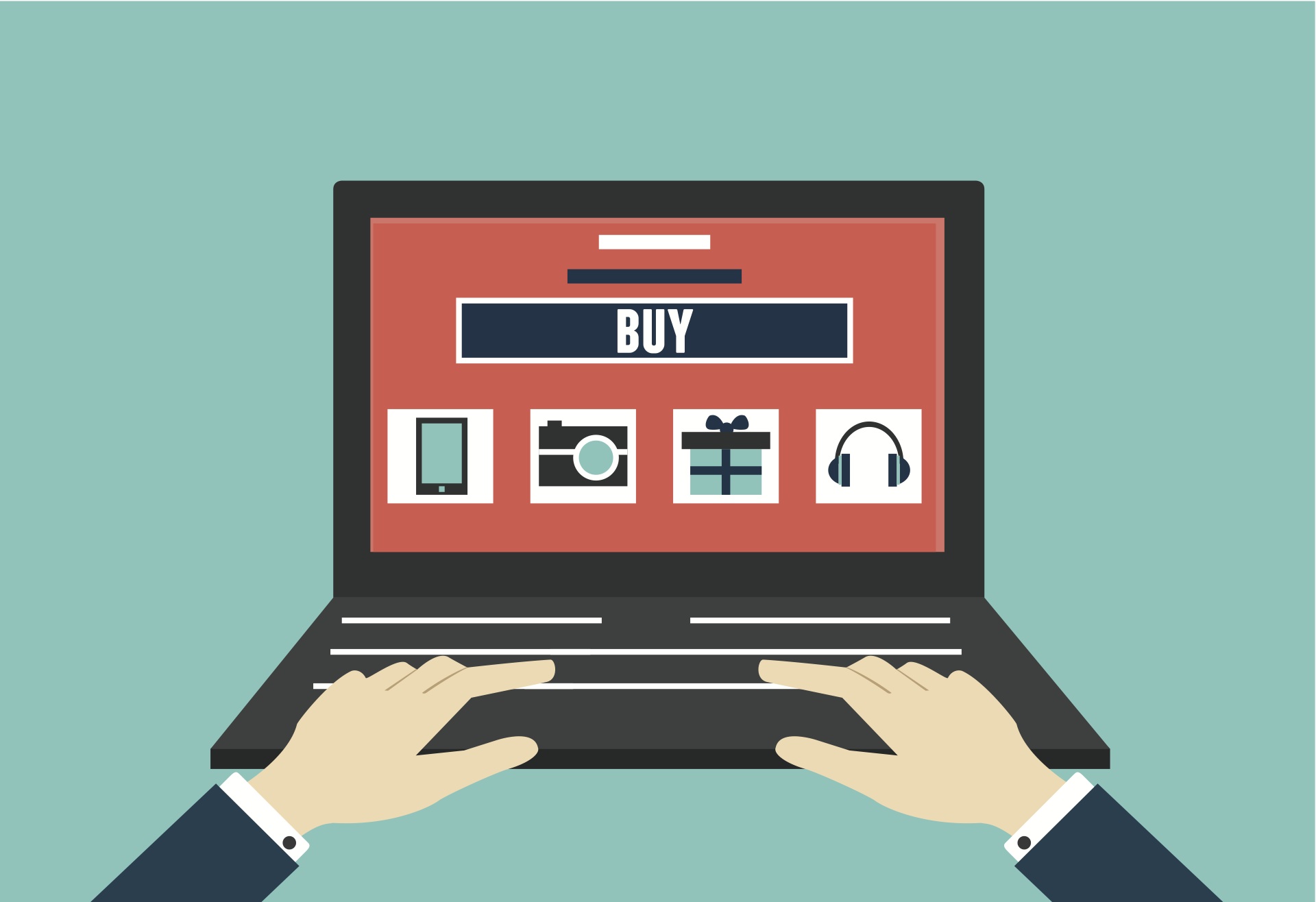
Button bashing
Please, please keep buttons where they should be! I am 100% behind responsive design, and original ideas, but there are reasons certain things are in certain places. Users expect their cart/bag/basket to be in the top right; customers expect to be able filter results in a navigation menu to the top or the left of products. Seriously, don’t go conceptual with these elements. The only time you can is when you’re a big, big brand (and sometimes this doesn’t even work, I can think of two examples off hand).
– Don’t use unconventional icons as shorthand
– Don’t try to break the expected, look at where others have a similar function and keep yours placed in that general area
– Do conform to the standard for your target country
Changing the checkout
There are loads of ways you can buy things online. I prefer the one-step checkout system. Most clients come to me with a set idea of “click this, go to that, then this bit comes up” and I will always tell them there are too many clicks or page loads. Simplify your design. A checkout should do just that and no more until it converts 99% of the time.
– Don’t crowd your checkout with more steps than it needs
– Do theme it, but…
– …Don’t overcrowd it! Make sure the process is king and blindingly obvious
Burst your pop-ups
Stop. Stop it. Stop asking for triggered pop-ups. I shan’t do it. Not on my watch! Yes, they do generate some clicks. Yes, I have put my email in to one or two of them. But, really, they annoy everyone. Think about it, you’re looking at something perfectly interesting and then BAM you’re interrupted by a pop-up. Worse still, you’re on your smartphone and can’t see where the close button is! Instant back button engaged.
– Don’t use triggered pop-ups on your home or product pages AT ALL
Okay, okay. I’m being a bit harsh here. How can we be sensible about designing your must have call to action pop-up?
– Do have them designed to be responsive, like your site is
– Do have them appear out of the way: don’t cover up your product or text
– Do make sure they’re relevant to the page
– Do visit the site yourself – if they annoy you, then it’s a bit of a red flag moment
Questions? Thoughts? Get in touch anytime: [email protected]
Until next we meet!